Showing posts with label design. Show all posts

Saturday, January 16, 2010

Pecha Kucha Vol. 5 - Fresno

This week was a big week for me as I FINALLY presented at a Pecha Kucha event here in Fresno.

I have had some ideas in the past as to what I would present if I ever decided to do so, so I finally decided to share some of my passion with the people of Fresno.

Watch my presentation here, thanks to James for putting this video together!


I think my presentation went well. I got a lot of compliments, and a fairly boisterous applause at the end (although I think I am attributing that to the 10-20 friends in the audience). My height was a disadvantage during the presentation, as I was probably the tallest presenter, and the mic was a little short (and I didn't bother raising it up). But overall I am very glad I presented, and I am looking forward to the the next time I can present.

Monday, November 16, 2009

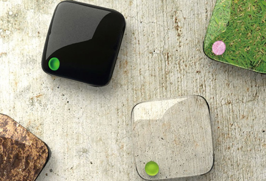
Cell Phone Design

Check out these creative design prototypes of cell phones.


What would you like to see in the perfect cell phone?

Monday, October 12, 2009

Dyson Fan

This summer I had the pleasure to use a Dyson Airblade Hand Dryer at the MoMA in New York City. I had wanted to try one from the moment I had heard about them, but never was at a place that had them. It was everything I hoped for and more. If you don't know about the Dyson Airblade, watch this video:


Dyson recently announced their new room fan, which in Dyson fashion is quite expensive. The best part of Dyson (in my opinion) is that they do tackle problems from different angles and utilize creativity to solve those problems rather than just taking the road well traveled. Dyson is a great example of marketing in design.


Read more about the cool background and features of the new Dyson room fan at Fast Company and UberReview.

Thursday, October 08, 2009

HTC HD2

My current phone as well as my last cell phone were both made by HTC. I thoroughly enjoy the phones they come out with, and in my mind they are really the only phones that compete with the iPhone. And one thing that blows Apple out of the water is the selection that HTC offers, whereas Apple's idea of selection is black and white.

I would like to introduce you to the new HTC HD2. I wrote previously about the HTC Touch HD, and was really impressed. The new HD2 is just as exciting.


One thing you may notice right away is the large screen. The screen is an expansive 4.3" diagonal (compared to the iPhone's 3.5") while still retaining about the same size as the iPhone. The screen is also capacitive (as opposed to resistive touch) and offers WVGA resolution (more than twice the resolution of the iPhone). The HD2 is a little thinner than the iPhone but it is slightly wider and taller. Other great additions for this phone include 448 MB of RAM, 1GHz processor, built in tethering, 5MP camera with dual LED flash, 3.5mm stereo audio jack, G/Proximity/Ambient light sensors, digital compass, as well as very inclusive integration of social networking including facebook, twitter, youtube and flickr.


Also check out the video about HTC Sense, which replaces TouchFLO 3D. It looks pretty great.

Friday, March 27, 2009

Alberta's New Logo

If you haven't heard, the Province of Alberta recently redesigned their tourism logo.

Growing up I always thought the old logo was good, but it needed an update. However, like almost everything else, what goes around comes around. The comment from Armin in the Brand New link above says it perfectly, "The old logo... is quite awesome and would probably sell like crazy on a ringer tee at Urban Outfitters."

Check out this brand book (PDF, 5.22MB) showcasing the new brand and what it means.

Also, check out this video.


The similarities in the "A" was one of the first things I noticed in when I saw the new logo. I like the new logo, and I don't mind the square at the end, which some people aren't too fond of.

What do you think?

Friday, March 20, 2009

Simple Logos

Read this blog post from Noisy Decent Graphics about the end of the life of black and white logos.

I agree with him about black and white logos being much less useful in a world of increasing digital presence. I also think that as we move completely away from paper and exclusively to digital medium then the black and white logo will cease to be of any use.

I do, however, continue to believe that a simpler logo is better than an extremely complicated one. Not only is having a logo that can cross mediums important, but also a simple logo allows for easier recognition.

Tuesday, March 17, 2009

Pecha Kucha

I was fortunate enough to attend Pecha Kucha Vol. 2 last night here in Fresno at the Starline.

What is Pecha Kucha you ask? Read this.

From all accounts it was a great success, especially since its only the second Pecha Kucha event held in Fresno, and the first one they actually started charging for. It was standing room only by the time the show started, with estimates of 150+ attendees. I got there early, and had great seats (can you pick me out of the first picture from the BeeHive post on the event?)

I really enjoyed Walmer Medina and James Collier's presentations, but all that I got to see where interesting in their own right.

While talking with my friend Andrew Ellenberger who attended with me, I thought that my Dad could make a great presentation at one of these things with his collection of Cereal Boxes. Of course, narrowing down his collection to 20 slides might in fact be the most difficult task.

I am really looking forward to attending Vol. 3 on June 8, 2009.

Saturday, February 28, 2009

Hide-A-Key

The problem with most hide-a-key solutions is that they are so common it is the first place people will look. Ie)fake rocks, under the doormat, etc.

I like this solution (from Think Geek via UberReview)


I'm sure if one really thought about it there would be lots of options for hiding keys. The biggest concern is remembering where the key is.

The Internet in 1996

Jason Kottke's recent post on "Was the internet boring in 1996?" got me recollecting about my history with computers and the Internet.

Unless you think about it 1996 doesn't seem that long ago, well for me at least, cause I am still fairly young. But 1996 is 13 years ago, and for me that is a little more than half of my life ago.

It is hard to think about everyone not being on the Internet, but back in 1996 there were a lot of people who weren't connected.

My family has always had a computer and some sort of Internet connection, thanks to my Dad who has always been at the forefront of technology. But my big Internet starting point was in 1996-1997. This was my first year of Junior High School at John D. Bracco in Edmonton, AB, Canada. I volunteered to help the IT guy put together a website for the school. This was very exciting because I got to do a lot of learning about HTML as well as getting to spend otherwise school time on the computer.

My three biggest memories of computer and Internet usage from 1996-1997:
  1. After Edmonton Oilers beat the Dallas Stars in Round 1 of the 1997 Stanley Cup Playoffs, I found and emailed a picture of Todd Marchant's game 7 winning goal to our IT guy. He put the picture as the wall paper for the entire computer system. It was only a thumbnail size, but brought so much emotion to using the computer because that was one of the most exciting goals I've ever seen.

    http://www.youtube.com/watch?v=lg4nLyxsi4g
    Infact, watching this goal still gives me goosebumps.

  2. I got a bunch of .bmp picture files that I wanted to put on the school's website I was creating. I knew enough to know that .bmp files wouldn't work on the Internet, so I converted them to either .jpg or .gif files (I can't remember which). The only problem was that they wouldn't show up on the webpage. No matter what I tried these files just wouldn't work. My Dad finally helped me trouble shoot, and we realized that I didn't actually convert the files, I just changed the file ending.

  3. I signed up for Hotmail so I could have an email account to get all my webpage design stuff completed more efficiently. This was back in 1996 shortly after it came into being, and before it was purchased by Microsoft. I remember very early on they employed a login button that was actually a picture with a link attached to it. I found this a little frustrating because I could type in my username, tab over and type in my password, but I couldn't just hit enter or tab and enter to finish the login process. I actually had to move over to the mouse and click on the login picture. I decided I would send this up as a suggestion to the Hotmail team, and sure enough the next day the login picture was gone and was replaced by a login button. I like to think I changed the course of Hotmail and free webmail service for the rest of time.
It is a lot of fun reminiscing about when back when on the Internet. What fun stories or good memories do you have of the Internet from the mid to late 90s?

Thursday, February 05, 2009

Use of Space

A follow up to a previous post about adaptive spaces and getting full use out of a space.

I was thinking that if certain rooms in your house are only used 1/8 to 1/3 of the day, and that is not very good use, then Churches are even worse offenders.

Assuming even 4 hours of Worship services a week (which I will assume is even a high average) and there are 168 hours in a week, these places are sitting empty and unused for almost 98% of the time. I think I would find it difficult to reconcile that if I were going to be building a new Church building. Now, this of course doesn't ring true for every Church. There are many churches that meet in schools, such as my friend Luke Mundy's church RVC Fresno.

As well, from what I understand, the Mormon's do a better job than most at utilizing space, including multiple "congregations" using the same buildings
In one sense, the local Church meetinghouse is a religious building principally dedicated to Sabbath worship but is also used for social, educational, and community activities during the other days of the week.
-From Mormon Church
Check out this page which illustrates possible uses of money that would be available if all the real estate owned by churches in the United States was sold. While you might not agree with all the ways that money should be spent, it is very interesting to see what kind of impact could be made with this change of thinking.

This was also something my family talked about as we visited Saddleback Church a couple of weeks ago. We found out that Saddleback Church has around 100,000 members, of which around 25,000 are very active. While the main campus we visited seemed at first glance huge, daunting, and maybe even over the top, it probably is a better use of resources than a bunch of smaller churches each having their own buildings etc.

According to this site the median church in the U.S. has 75 regular participants in worship on Sunday mornings and an average of 186 attenders. Let's split up the 100,000 members of Saddleback by 125 people in a regular congregation and we come up with a whopping 800 different churches. That means 800 church buildings and parking lots. I don't know the exact number, but I would wager a lot of money saying that Saddleback doesn't come anywhere close to the square footage of 800 separate churches. This just goes to show the efficiency of scaling up, especially in churches.

What do you think?

Wednesday, February 04, 2009

Adaptive Spaces

This post on Treehugger really intrigued me. The facts about specific rooms only being used for fractions of the day were especially interesting.

This is one of the big reasons I bought a Smart Car. Sure there might be times when I could use my car to transport more than two people (including myself) but especially for this point in my life, I rarely do. When those situations come around, there are other options.

I do realize that a living space is a little different than a car, and that having dedicated spaces to which to retreat can be extremely valuable, these situations can just use a little bit of good old creativity, such as getting out of the house, etc.

Wednesday, November 12, 2008

Picture of the Day

I like this picture from an article in Treehugger about 8 Green Music Festivals That Rock.


Do you think people would think twice about throwing garbage in a can if it is labeled landfill?

Saturday, October 25, 2008

MultiTouch Cell

From a Finnish company MultiTouch, check out this new, scalable, multi-touch display.

http://www.youtube.com/watch?v=ur2qKbtapnc

Looks pretty sweet, but I'm sure not very affordable at this point.

Via Josh Spear

Tuesday, October 21, 2008

Creative Lamp Designs

I really enjoyed looking through this list of the 40 Most Creative Lamp Designs Ever.

I was, however, a little disappointed that the first lamp that popped into my head when I heard the title didn't make the list.

Via Presurfer


Tuesday, October 14, 2008

Design Impacts Marketing

This is a great example as to why good design is so very important. You can spend all the money in the world on marketing, but if your product or service is no good, people are going to find out.


Your marketing efforts are not the only ones for your product or service.

Saturday, September 27, 2008

Luxury Trailer

Check out this trailer from T@B.

I am not really looking at buying a trialer, but I definitely think I would consider this if I was. The key to an RV is that you can live in luxury in the wild. Most large RVs accomplish this with both size and luxury. From the RVs I've seen, size is the real source of the luxury. The T@B XL appears to derive its luxury from luxury itself, and it isn't so big that you can barely maneuver it around the campsite. I love camping in tents and "roughing" it just like the next guy, but if I wanted a trailer this would be the one. Plus, it doesn't appear to be that expensive either (for a nice trailer), only around $62 000.


Via UberReview


Thursday, September 18, 2008

Virtual Pet

Who needs a pet when you can just get a virtual one online.

I would like to disclaim this with a warning that if you dislike spiders, I would recommend not visiting this site.

Play With Spider is a 3D flash program that allows you to play with and control a spider. You can adjust a lot of variables to change appearance and motion of spider, as well as drop little insects for the spider to eat.

The spider is creepy enough to have me slightly worried that it might try and attack my mouse cursor, but so far so good.

Via BoingBoing

Thursday, August 28, 2008

Fresno Co-Housing

Check out this development in North Fresno called La Querencia. It is a 28 unit sustainable neighborhood with common areas, pools, vegetable gardens, and solar panels. It looks pretty neat, and if I were in any position to be buying a house right now, this would be something I might consider. These are the kind of things of which Fresno should try and get a lot more.

Via Fresno Famous

Tuesday, July 08, 2008

Perspective

Here is a great post at Noisy Decent Graphics on perspective as related to maps. As someone who loves maps, I've always found it interesting when maps are positioned in different ways, or when the curvature of the earth is not taken into account on maps, etc.

Monday, June 02, 2008

A Future Option for Transportation

While I am very excited for my new Smart Car to arrive this summer, my excitement for the advancement and future of transportation exceeds even that.

Check out this new car, the Aptera.


The Aptera is a new vehicle coming out within the next 1-2 years, and it is available in plug-in hybrid variety and purely electrical. While this is not entirely new, the most fascinating aspect is the way it looks. Some say it is a cross between an airplane and vehicle from the Jetson's. It doesn't fly, but it does get incredible mileage.

While this concept may or may not "take-off", I am mostly excited to see people thinking outside the box (every single other car on the market) and being creative and experimenting with design.

I love the way it looks as well as the environmentally friendly attitude in which it drives.

(Via Josh Spear)